The team has reported time savings of 30-60 seconds per customer call, and gives them investigative consistency even in emergency situations like flash floods and drought.
Primary user groups have completely adopted the tool, and secondary groups across the organisation have a 72% return rate.
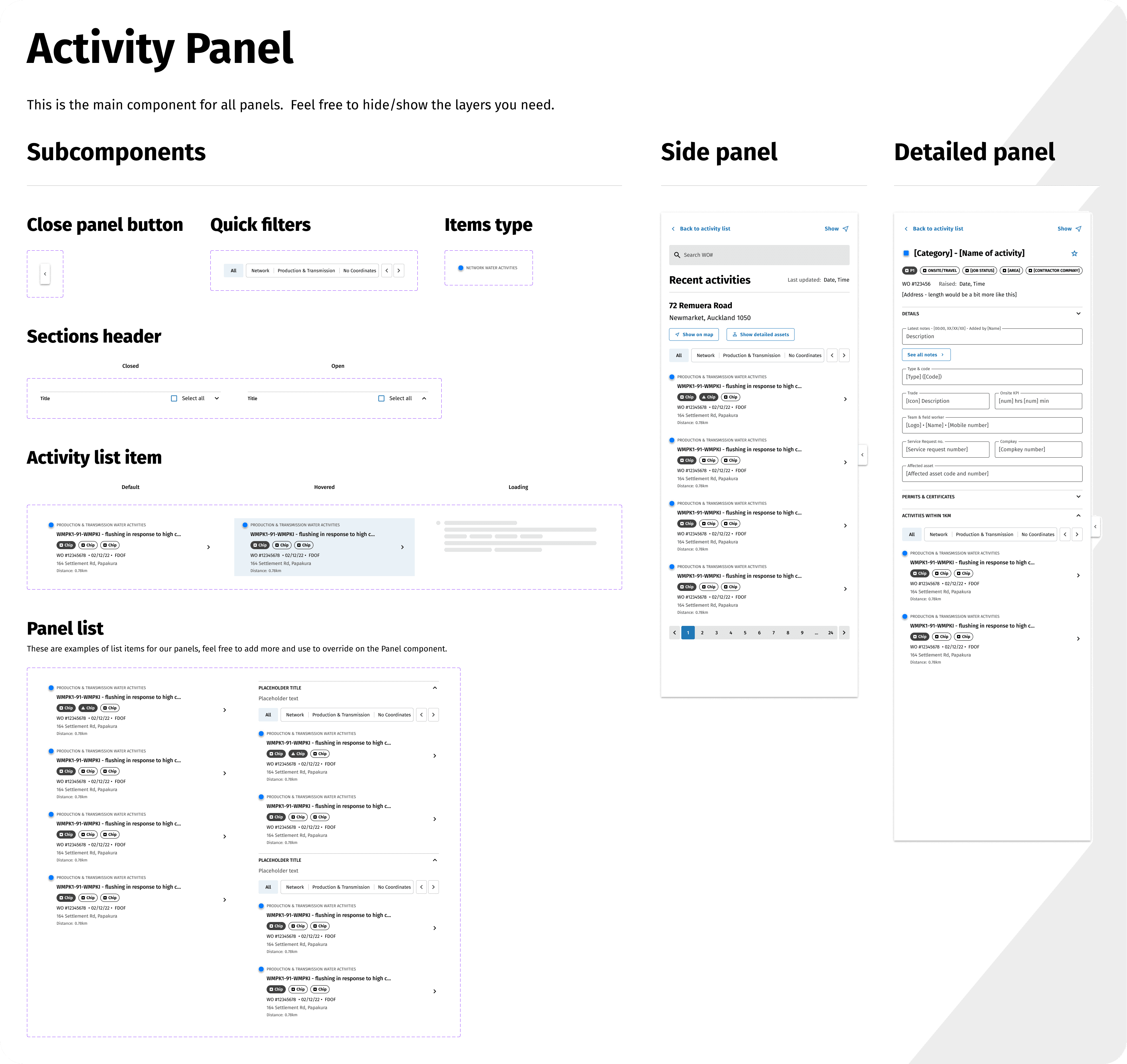
A design system with tokens and flexible design choices prepared Activity Tracker for continued expansion, enabling national scale.
Clunky and difficult to use, with important information lacking context in a spreadsheet. Activity Tracker combined 6 datasets into 1 intuitive geospatial interface with near-live updates.
In a nutshell
Watercare
Lead UX Designer and Researcher
2022 - 2023
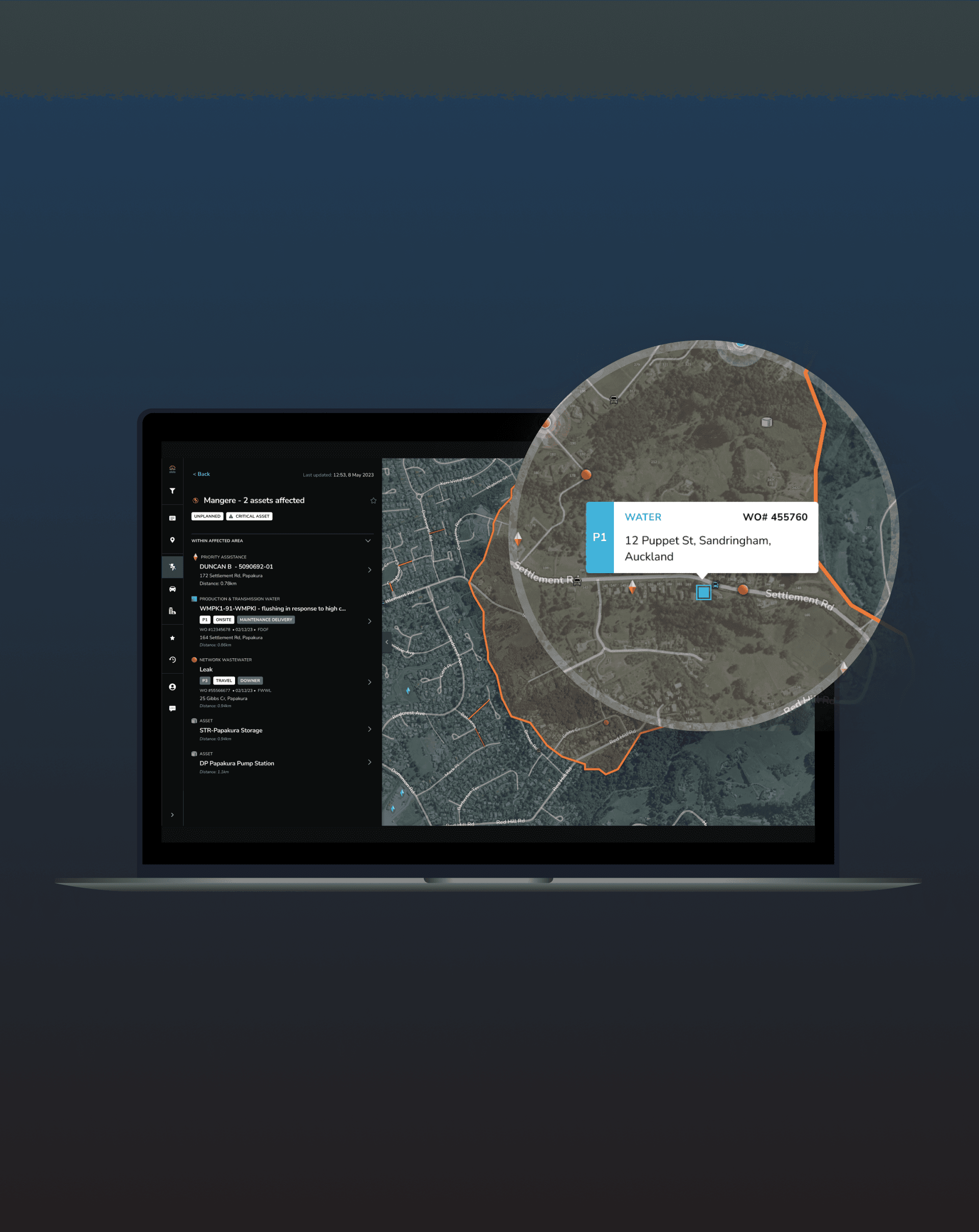
Activity Tracker is a geospatial monitoring tool that modernises how Watercare manages critical assets and utility infrastructure across a 5,000 km² network.
I led research and hands-on design to ensure Activity Tracker was ready for launch and built on a foundation that could scale nationally and adapt to new organisational contexts.
The challenge
Not just another tool in the toolbox.
Watercare staff were already managing too many systems. Activity Tracker had to be the Swiss Army knife that replaced them: powerful enough to handle complex operational data, intuitive enough to learn without disrupting workflows, and built on a foundation that could scale beyond Watercare entirely.
Phase 1: Understanding and establishing the foundation
The first year focused on deeply understanding Watercare staff workflows and laying the groundwork for Activity Tracker. I uncovered real needs, shaped core layout and interaction decisions, and ensured the system was practical, intuitive, and aligned with day-to-day operations.
The research
Discovery research and usability testing: Understanding how people actually worked
We ran an initial two rounds of 1:1 interviews with Watercare staff, exploring workflows, information needs, and pain points in the first round and validating design iterations in the second.
💡 Unlocking hidden workflows with contextual inquiry — Controllers were hard-to-access, always-on users with invisible workflows and long, irregular shifts. I championed deeper insight with this audience through contextual inquiry, uncovering real practices from key priorities to restrictive desk setups, that were difficult to get through 1:1 interviews.

My colleagues sitting with a Controller in their control room, 2022.
Beta testing: Validating before we shipped
As we moved closer to launch, I ran an internal beta testing round with surveys and targeted 1:1 sessions, validating functionality, refining map and sidebar interactions, and prioritising future features. Insights from all research directly shaped design decisions, interaction patterns, and the foundation for future scalability beyond Watercare.


The insights
Assumption: The map was the hero
Very few tools at Watercare were geospatial, so we prioritised map-based interactions. Activity details lived in floating overlays, key functions like search were collapsed into small, dense controls, and important data was presented based on its position on the map.
Analysis: Until we saw how they actually worked
Familiarity is a tough competitor. Many staff had used the same clunky tools for years and built workarounds that worked for them. Any friction with the legends, overlays, clustering, or panels was a reason to revert to what they already knew.
The moment of delight: everything at once. When users opened an activity detail panel and immediately saw everything they needed without drilling, they felt Activity Tracker's value.
Synthesis: Design for the person who already knows how to do their job
Users knew exactly what they were looking for — they just needed to get there without friction. The panel, not the map, was where that happened. Every decision that followed was about making that path as fast and clear as possible.


The outcome

The Activity Tracker demo and launch event.
Change management: Getting the organisation ready to adopt
The beta launch combined six months of research and design work. We presented a demo to the organisation, ran targeted communications, and collected feedback via surveys, ensuring the tool was tested, understood, and ready for adoption. Ongoing collaboration with Controllers and Operations built credibility and excitement across the organisation, turning key users into internal advocates.
Journey mapping: From research to executive buy-in
I synthesised research, iterations, and validation into a Journey Map capturing all 3 primary user group workflows and interactions. Every step and feature, current or pipeline, reflected real user insights.


The map was printed, put on the kitchen wall, and became a key artefact for the Product Owner to communicate Activity Tracker’s value to executives and the organisation, making a complex system understandable at a glance and highlighting the evidence-based decisions behind the design.
Launched and 100% adopted
Activity Tracker launched in June 2023. Of the primary user groups, we have 100% adoption rate. 🎉
Phase 2: Scaling and future features
The second phase focused on preparing Activity Tracker for broader organisational contexts. I worked closely with the Watercare team, which later joined the nationwide water reform, supporting new functionality, scalable workflows across multiple regions and asset types, and laying the foundation for future enhancements.


The retrospective
The outcome: Faster decisions, confidence in scale
Activity Tracker launched supporting three distinct user groups across Auckland's 5,000 km² network. Phase 2 extended that foundation to multiple regions, asset types, and workflows with consolidated components, design tokens, and a scalable iconography system built to absorb any future expansion without rework.
Detailed drill-downs, new filters, and map shortcuts give users precise control. Intuitive layouts make critical data legible in seconds including during high-pressure situations like flash floods and drought.
The takeaway: Know your users
Two years embedded with the Watercare team taught me more about their users than any formal testing session. Sitting with Controllers, watching staff use the tool live, and receiving ad-hoc ideas from potential users about their pain points kept design decisions in real workflows, and most importantly, real people.
The impact: A long-lasting client partnership
We started with Activity Tracker, but the dedication, quality of work, and relationships built over two years led to something beyond a single project. Since launch, I've continued working with Watercare — co-facilitating a Journey Mapping workshop with their BA chapter and contributing to a UX knowledge base to support ongoing capability building across the Digital team.